A 1980s Condo Goes Retro Vintage
Creative problem-solving brings finesse to a Minneapolis row house gutted in 1979, blending historic elements and modern use in 1200 square feet.

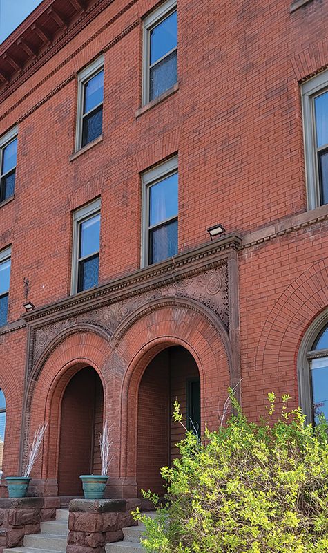
Over time, many of the 1890s brick-and-brownstone row houses ringing downtown Minneapolis were demolished to make way for freeways and urban development. This one survived, despite a 1979 renovation that divided the building into condominiums and stripped out the original woodwork.
The homeowner’s condo occupies half of the second floor and all of the top floor, affording million-dollar views of downtown. Research found that the building was designed by architect Warren Howard Hayes and built in 1889. It deserved better.
The Homeowner Weighs In
“I was drawn to working with an architect because I knew they would be able to bring creative problem solving and an artistic finesse that builders might not,” says homeowner Seth Goodspeed, who chose David Heide Design Studio after seeing their work on another historic row house. “The Studio brought a lot of value … because this is a tight space, I had an even better reason to hire an architect. I also wanted someone who valued the architectural heritage of the building.”

“When Seth interviewed us, we realized he would be our youngest client—by more than a few years,” Heide says, “He wanted to do well by the building and to spend his money wisely.”
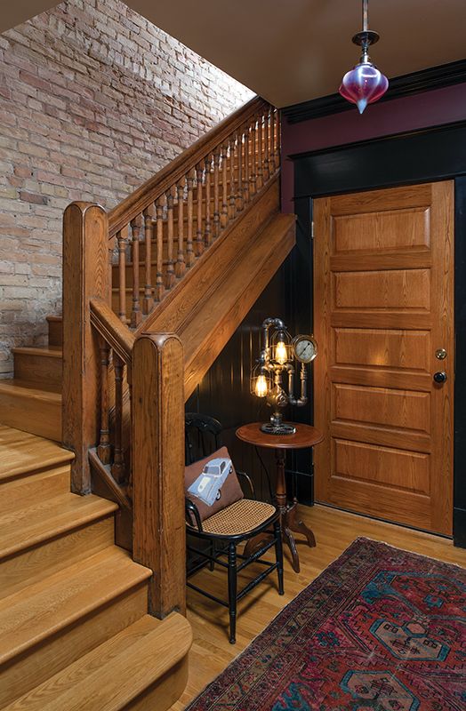
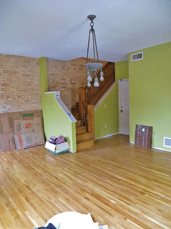
During the 1979 conversion, the floor plan had changed and the plaster was removed from the brick walls. The only original element was the staircase, though the balustrade was hidden behind knee walls. The second-floor space had been open concept—with no walls or closets.
A removed area in the ceiling looked up to a kind of balcony in the third-floor dining room, perhaps an attempt to make the space look like an industrial loft. When asked to describe this sacrilege, designer David Heide replied, “I have no words.”
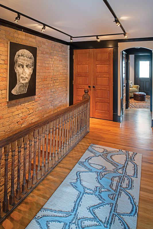
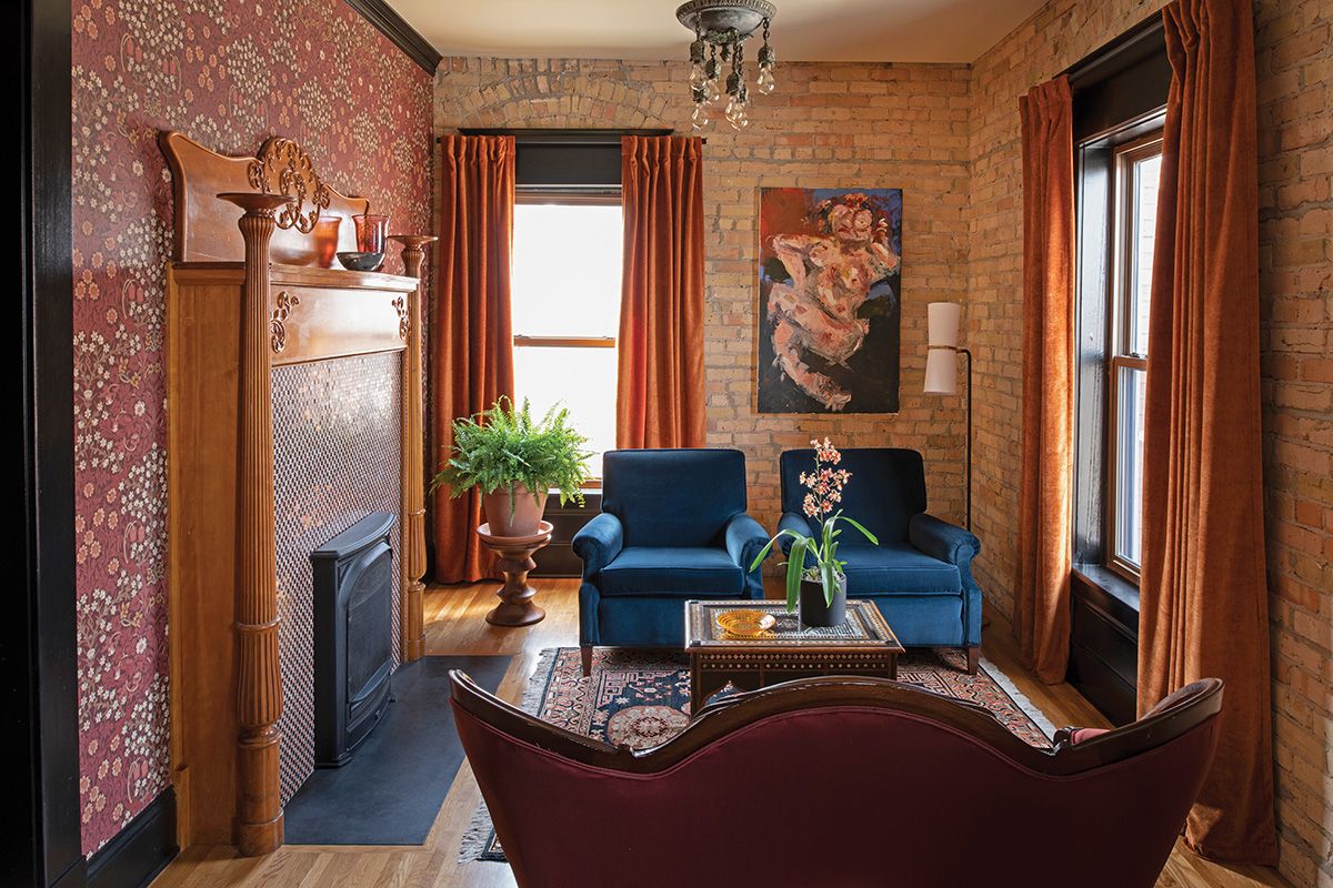
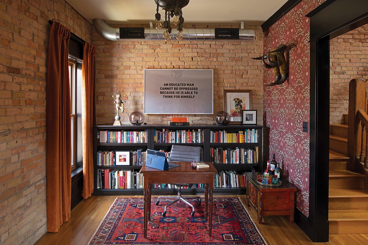
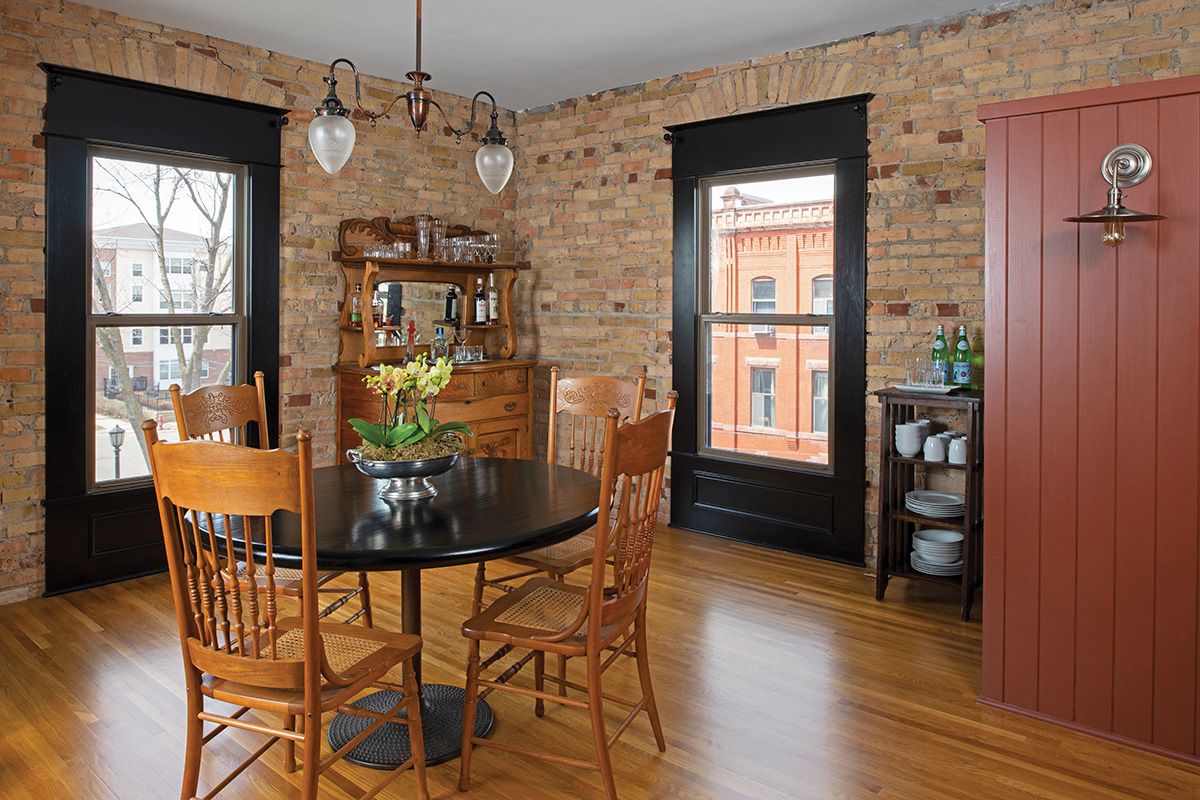
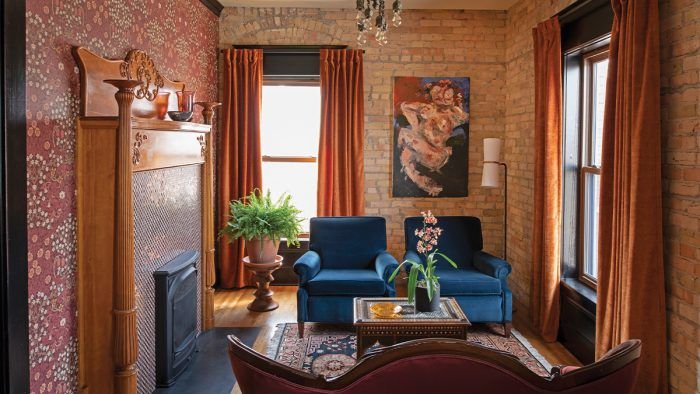
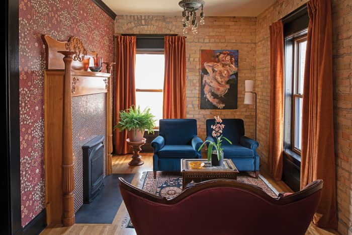
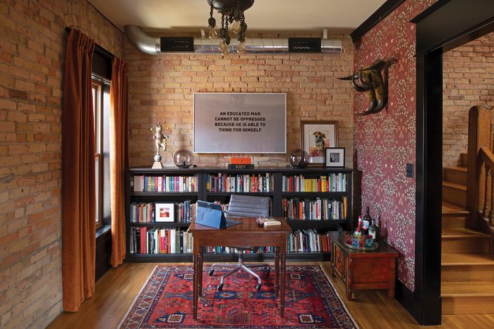
The design team didn’t re-create the historic interior. Instead, they redefined the condo with a clear floor plan, historically accurate elements alluding to the age of the building, and spaces for contemporary living. The entry is to a large living room and library, where a salvaged mantelpiece and period wallpaper join walls of exposed brick. The third floor holds the kitchen and dining area, a den, and the primary bedroom along with a tile-and-marble bath.
What Changed?
Major fixes included adding a closed utility/storage room, moving the door to what had been a second bedroom to give it new purpose as a more public den and TV room, and fixing the loft/balcony situation. “It was a no-brainer to fill that gap in the floor, adding 40 square feet back into the dining room!” Seth says.
|
|
|

Other improvements brought back historical character. Gone are the cheap, hollow-core doors, replaced by paneled oak doors with Emtek hardware. A new arched opening reflects the brickwork over windows. Period-appropriate millwork was returned, painted black for a contemporary contrast to the oak doors and brickwork.
These deft additions returned an appropriate scale to the home. (For this project, David Heide Design Studio won the 2019 ASID MN Design Excellence Award for Historic Restoration/Preservation.) Money was thoughtfully allocated. The new, safer gas fireplace has a surround in checkerboard marble, “a splurge,” Heide says, “but we didn’t need much.”
|
|
|
|
|
|

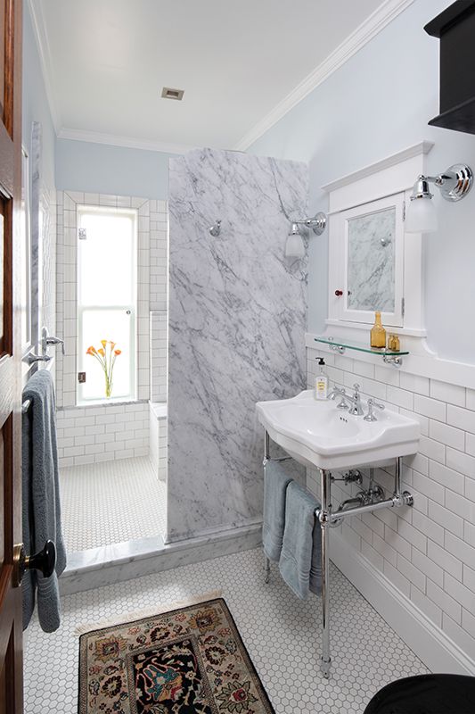
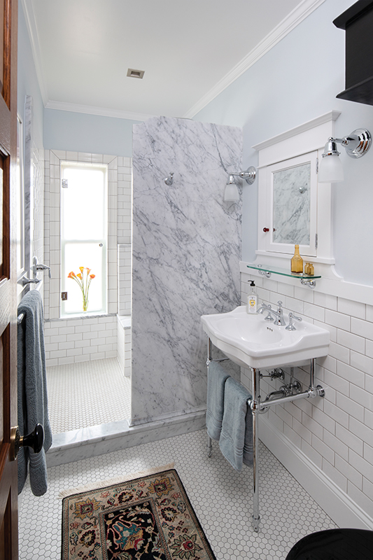
Another appropriate expense was using a “shower door” of obscure plate glass on the bathroom window. “It protects the original window and provides privacy while maintaining full use of the window and full light,” Heide explains, “—worth the money as a long-term solution.”
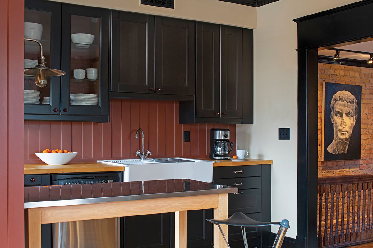
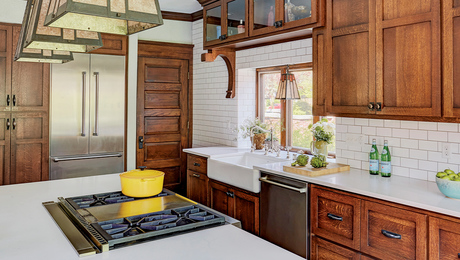
The black IKEA kitchen was Seth’s handiwork, a testament to his hands-on approach and budget savvy. The designers moved the refrigerator to add a cabinet and tweaked other details to give it a custom built-in appearance.

Lighting fixtures are vintage. “I was able to find the pair of ceiling fixtures in the living room, at Architectural Antiques in Minneapolis,” Seth says. “Once again, David worked his magic to find the other fixtures, by scouring antiques shops across Minnesota, South Dakota, and Iowa.” Seth notes that the antique glass fixture in the entry was a birthday present to him from David.
|
|
|
Another goal of the project was to showcase the owner’s extensive art collection. “I’ve been fortunate to work with many local and emerging artists,” Seth says. “If I have a personal connection to an artist and want to support them, chances are their work is hanging on my wall.
“I typically look for a sense of humor and, to balance the space, often something modern in juxtaposition to the historic elements of this house. I’ve gotten to the point where I occasionally need to rotate art because I’ve run out of wall space.”
Bare Brick Interior Walls: A Modern Obsession That Can Be Oddly Attractive
“I shall tread lightly here,” winks your editor. Once upon a time, Old-House Journal railed and wailed against “the bare brick mistake” as, in 1970s Brooklyn, we witnessed recently arrived homeowners and their contractors tearing out three-coat plaster to expose brick party walls that were never meant to be seen. We imagined the masons rolling in their graves.
Sometimes plaster was demolished because it was in poor condition—as can happen when plaster is applied right over exterior masonry. In many cases, the plaster then was not replaced for reasons of budget. Less excusable to us was the purposeful baring of brick for a new aesthetic, a kind of postmodern obsession with unadorned building materials. (A corollary is when “original ceiling beams” were exposed, although really they were the rough joists for the floor above, always meant to be ceiled.)
Unexpected consequences ensued. The bricks, very often not first quality as they were meant neither to weather nor to be seen, would spall and create dust. The lime mortar, too, might create particulates. (Caution: Sealing a brick wall changes the color and often creates new problems.) Sweaters got pulls if an elbow rubbed the jagged wall.
Stripped of the highly insulative plaster, brick exterior walls were cold; broken mortar joints would even allow infiltration of outside air. Interior walls newly bared turned out to be less sound dampening, an especial nuisance when neighbors on both sides of a party wall decided to remove plaster.

Fast Forward
Roll forward fifty years. The worst brick walls have been returned to modesty, covered again behind plaster or drywall. Meanwhile, tastes have changed. Many of us have been in an old mill or another industrial building converted into a restaurant or a hotel: those bare brick walls, so appropriate to the transition of adaptive reuse, create a warm and textured backdrop with undeniable appeal.
Acceptance carries over to houses that lost their plaster in renovations from the 1960s through the 1980s. It remains expensive to replaster and bring back all the lost trim. A true preservation mindset would keep the bare brick walls exposed decades ago. (Permission to demolish original plaster today is not implied.)
That was the approach taken by owner Seth Goodspeed and his architects and designers. (See previous story.) In this case, the exposed brick walls were well laid and are sound and even. “We did not consider this project a restoration,” says David Heide of David Heide Design Studio. “Rather we were newly interpreting a poorly done, inexpensive condo conversion of 40 years ago. And our client felt the brick walls were part of the charm of the house as he found it.”
Homeowner Seth Goodspeed tells us, “Yes, the brick walls lost some thermal performance. The living room has temperature fluctuations that reflect Minnesota’s extreme swings. I don’t have any sound issues [due to the lack of plaster].” Seth reports that he’s had to drill only two holes into the brick to hang art; in the rest of the house, Heide added new picture rails to accommodate hanging the collection.
— Written by Patricia Poore. Photographed by Scott Amundson except where noted.
RELATED STORIES
-
The paneled door opens to an entrance hall in common with the neighboring unit below. The antique glass ceiling fixture came from Des Moines.
-
The entrance hall before.
-
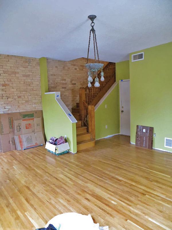
When Seth Goodspeed arrived, 1970s shag carpeting covered water-stained subflooring. Fixing the floors was done before move-in. Then “I added my own unfortunate wall colors,” Seth laughs.
-
The brick-and-brownstone house is in the Stevens Square neighborhood of Minneapolis.
-
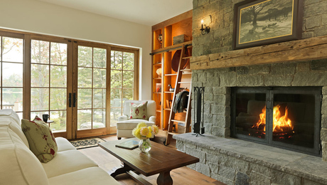
Checkerboard marble surrounds the cast-iron gas insert that replaced an impractical woodburning fireplace dating to 1979. The settee belonged to the owner’s great-grandmother. Chairs are ca. 1949. Drapery is from West Elm. The salvaged, 1890s oak mantelpiece and Morris & Co. ‘Blackthorn’ wallpaper elevate the living room, nodding to the era of the building.
-
The other end of the living room is furnished as a library.
-
Most existing cabinets and the sink came from IKEA; a tongue-and-groove backsplash was added.
-
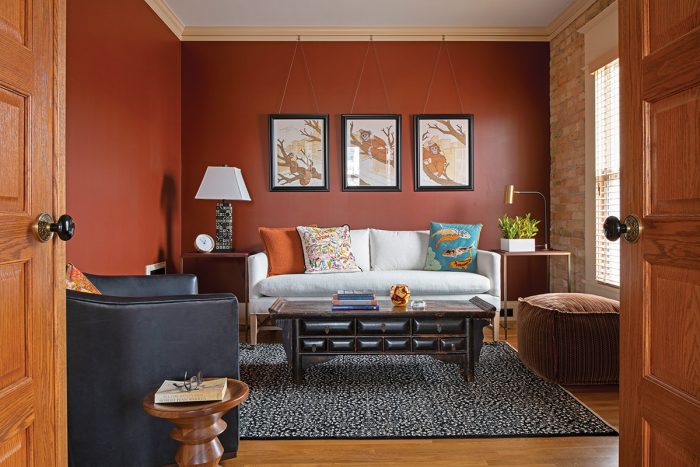
A second bedroom was converted into the den/TV room, with new double doors opening to the dining room for better flow. The screenprint tritypch is “Monkeys Are the New People” by Chuck U.
-
The hutch is a local antique found by the homeowner. It sits in the area once strangely open to the floor below. The refrigerator was moved out of the galley area into a cupboard matching the backsplash, freeing up space for an additional cabinet in the kitchen.
-
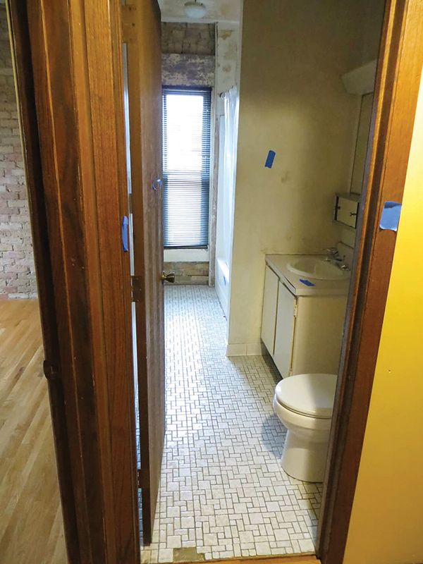
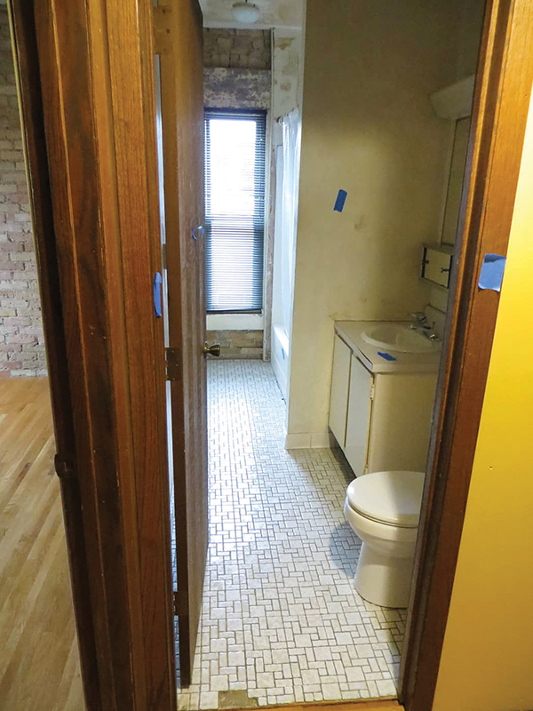
The bathroom is in the same location as before but with all new treatments and fixtures. inset “Before” pictures show that the 1979 conversion was done on the cheap.
-
The bathroom before.
-
Photo courtesy gioia / adobe stock.